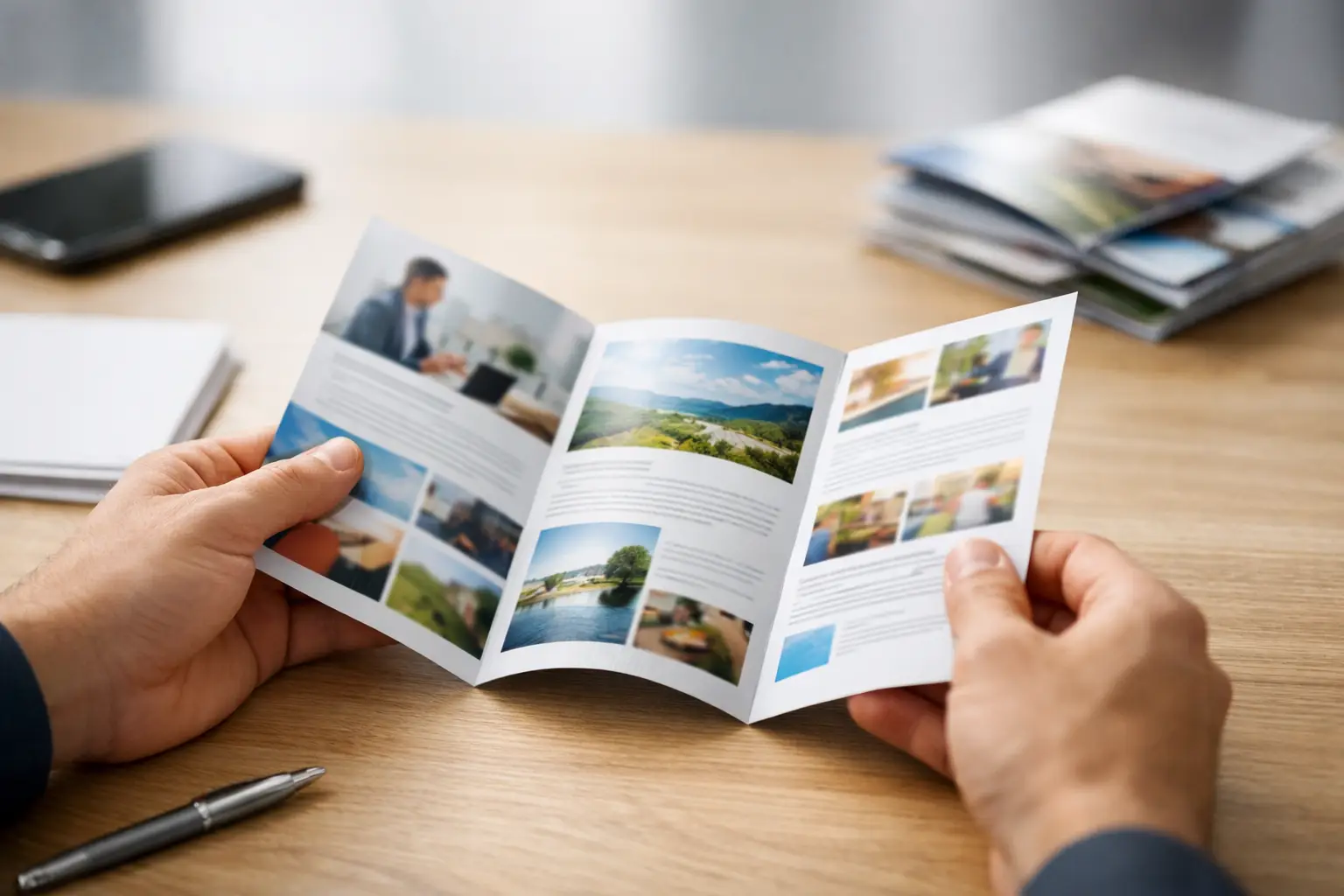
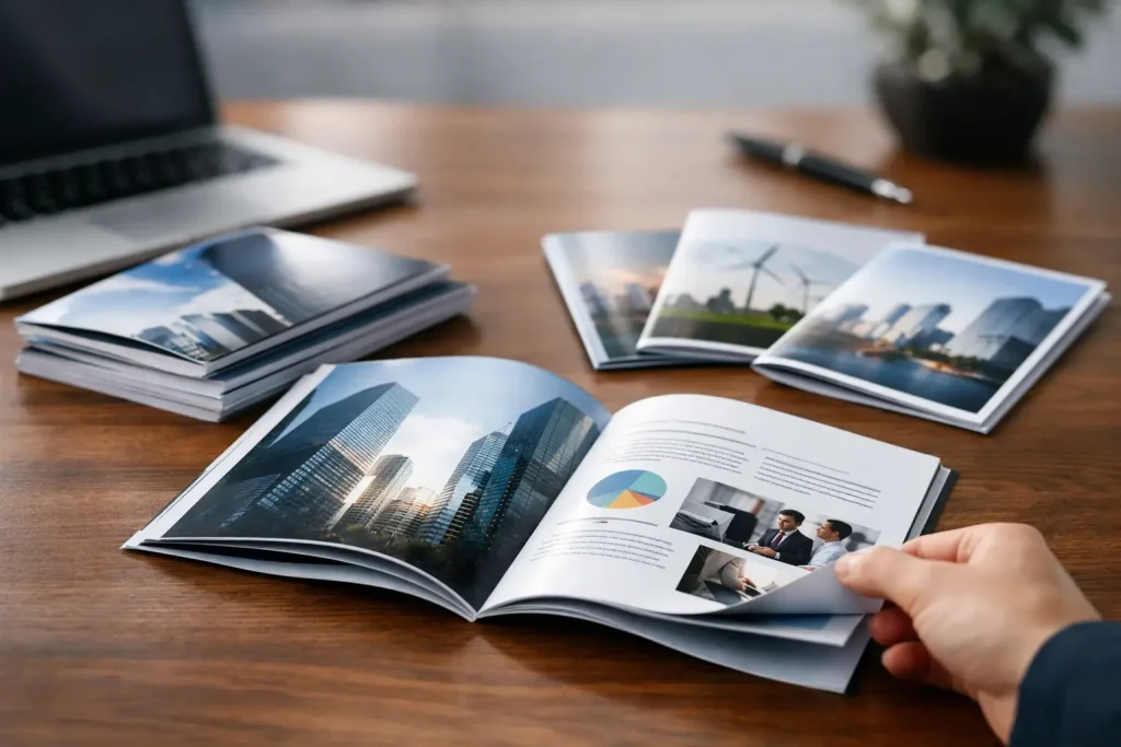
A single sheet can do a lot of work when the layout is right. That is why folded leaflet printing remains a practical choice for businesses that need to explain services, promote offers or hand out useful information without paying booklet prices. It gives you more room than a flyer, keeps the piece compact, and helps people follow the message in a clear order.
Why folded leaflet printing still works
For many businesses, a flat flyer runs out of space too quickly. You can fit the headline, a short offer and contact details, but once you start adding product ranges, service steps, menus or event information, it gets crowded. A folded leaflet solves that problem by creating panels that separate the content.
That matters because people rarely read marketing materials from top to bottom in one go. They scan. They look for the section that answers their question. With folded leaflet printing, you can guide that behaviour. The front panel grabs attention, the inside panels explain the offer, and the back panel handles practical details such as contact information, opening times or booking instructions.
It also works well across different sectors. Tradespeople use folded leaflets to break down services and service areas. Restaurants use them for takeaway menus. Schools, charities and community groups use them for events, programmes and fundraising campaigns. Start-ups often use them at exhibitions when they need something more informative than a standard handout.
Choosing the right fold for the job
The fold style is not just a print detail. It changes how people read the leaflet and how much information you can place in each section.
A half fold gives you four pages in total, like a simple greeting card. It suits straightforward messaging where you need a front cover, two inside sections and a back panel. If you are introducing a service, promoting a seasonal offer or creating a price list with limited content, this is often enough.
It is also one of the easiest formats for first-time buyers because the panel layout is simple and less prone to design mistakes.
Tri-fold
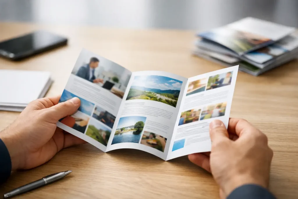
The tri-fold is one of the most popular options in folded leaflet printing because it balances compact size with useful space. It creates six panels and works well for step-by-step information, segmented service lists or venue guides.
The trade-off is that content must be planned carefully. Each panel is narrower, so large blocks of text can feel cramped. If your design relies on wide images or long paragraphs, a tri-fold can start to fight against the message rather than support it.
Z-fold
A Z-fold also creates six panels, but it opens in a continuous way rather than with one panel folded inside another. That makes it useful when the content needs to flow from one section to the next, such as a process guide, timeline or map-based leaflet.
It feels slightly more open and linear in use. For businesses explaining how a service works, this can be a better fit than a tri-fold.
Gate fold and other options
For launches, premium promotions or high-impact event material, more distinctive fold styles can add interest. The issue is practicality. More complex folds can cost more, may not suit every artwork, and can slow down decision-making if you are trying to order quickly. In many cases, a standard fold wins because it is easier to design, easier to understand and better value.
What to include in a folded leaflet
The most effective leaflets do not try to say everything. They prioritise the information a customer actually needs to act.
Start with the front panel. This is where the main promise should live. A clear headline, a short supporting line and strong branding are usually enough. If the front is overloaded, the leaflet loses its stopping power before it is even opened.
Inside, organise the content in the order people are likely to care about it. That might mean leading with benefits, then service details, then pricing cues, then proof such as testimonials or key facts. If you are listing products, group them logically rather than filling every panel with unrelated items.
The back panel is often wasted, but it should not be. It is a reliable place for contact details, social handles, QR codes, opening hours, a small map or booking instructions. Think of it as the panel that helps someone take the next step once they have decided they are interested.
Design choices that make a leaflet easier to use
Good leaflet design is not about squeezing in as much as possible. It is about making the content easy to read quickly.
Keep headings short and obvious. Use panels for separation instead of relying on tiny text or thin dividing lines. If every panel looks the same, readers have to work harder to find what matters.
Images should earn their place. A few relevant, well-sized visuals will usually outperform a page full of generic stock photography. For service-led businesses, photos of real work, products, premises or team members often feel more credible than polished but vague imagery.
White space matters more than many buyers expect. Leaving room around text and images gives the leaflet structure. It also makes the print feel more professional, even when the budget is tight.
If you are working with a lot of detail, such as menus, treatment lists or programme schedules, resist the urge to shrink everything. That is usually where readability falls apart. It is often better to simplify the message or move to a larger format than to produce something people struggle to read.
Paper, finish and print quality
Paper choice affects more than appearance. It changes how the leaflet feels in hand, how colours reproduce and whether the piece suits the purpose.
A lighter stock can be cost-effective for door drops, mass distribution or short-term promotions. A heavier stock tends to feel more substantial and may suit brochures handed out at meetings, trade shows or reception desks. Neither is automatically better. It depends on where the leaflet will be used and how long you expect people to keep it.
Gloss finishes can make colours look brighter and images more vivid. They are often a good fit for retail, food promotions and visually led campaigns. Matt finishes feel softer and can give a more understated, professional look, especially for corporate services or premium brands.
There is also a practical angle. Heavy coverage, dark backgrounds and full-bleed artwork can look strong, but they may show marks more easily depending on the finish. If your leaflets will be handled a lot, posted or stacked on counters, durability is worth considering.
Common mistakes in folded leaflet printing
Most leaflet problems are not caused by the printing itself. They begin in the artwork.
One frequent issue is forgetting that folded panels are not always identical in size. Certain folds need one panel slightly narrower so the leaflet closes properly. If the design ignores that, text and images can sit awkwardly once folded.
Another problem is treating each panel like an isolated poster. A leaflet should feel connected when opened and useful when folded. If the message only makes sense when fully spread out, the individual panels lose value.
Too much copy is another regular problem. Businesses often want to include every service, every feature and every selling point. The result is a leaflet that says more but communicates less. Clear editing usually improves response more than extra text does.
Low-resolution images, weak contrast and tiny contact details can also let down an otherwise solid design. Before sending artwork to print, it helps to check the leaflet at actual size on screen or in a simple printout. What looks readable at 200 per cent zoom may be much less convincing in the real world.
When folded leaflets are better than flyers or booklets
If the message is short and the aim is fast visibility, a flyer may do the job more cheaply. If you need multiple pages of detailed content, a booklet may be the better fit. Folded leaflet printing sits in the middle, and that is exactly why it is so useful.
It works when you need structure without the cost or complexity of a bound product. It is ideal for businesses that want to present a service range, event schedule, menu, price guide or promotional offer in a format that feels more organised than a single sheet.
For many buyers, that middle ground is the sweet spot. You get enough space to be helpful, but not so much that the piece becomes expensive or overproduced.
Ordering folded leaflets without the usual hassle
If you are buying print for a real campaign, speed and clarity matter just as much as the finished product. That is why it helps to settle a few basics early: your fold type, finished size, paper choice, quantity and whether the leaflet needs to prioritise impact, detail or durability.
Once those decisions are made, the rest becomes much easier. A straightforward ordering process, sensible pricing and access to design support can save a lot of back-and-forth, especially for businesses that order print regularly but do not have an in-house designer. That practical approach is a big part of why companies use suppliers like Conkea for everyday marketing materials.
A folded leaflet should not feel complicated to buy or difficult to use. If the format matches the message, it becomes one of the simplest ways to put useful, well-organised information into someone’s hands and give them a reason to keep reading.